The Rising Tide

Today is a guest post from my friend Marion. She recently visited an open air exhibit with a difference and shared her pictures with me. It would have been something I would have loved to see in person.

However, we are lucky to have technology at our fingertips to make sharing our experiences much easier…so now I’m able to share her pictures with you too.


The Rising Tide by Jason deCaires Taylor (London, England)

The first London commission of world-renowned underwater sculptor Jason deCaires Taylor, The Rising Tide, is concealed and revealed by the daily ebb and flow of the tide on the Vauxhall foreshore. These four proud horses and their riders highlight the role of the Thames as the lifeblood of London, shaping the city’s great history as an ever evolving centre for culture, industry and commerce.

Marion stayed to capture the photos from low to high tide (do you know how long that would have taken?) Due to her tenacity and patience we can see how the sculptures are covered by the River Thames over time.

“As it was such a stunning day I watched the incoming tide flow around them until they disappeared…. it was like a meditation .. not just watching the sculptures but the river too.”
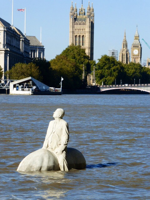
The Houses of Parliament

You can find out more about the artist and the sculptures here


All photographs in this article taken with thanks  © M Sumerfield

Miami Pixel Art

I had to go to Miami International Airport the other day to meet someone visiting. From time-to-time there are art exhibitions and artwork around the airport.

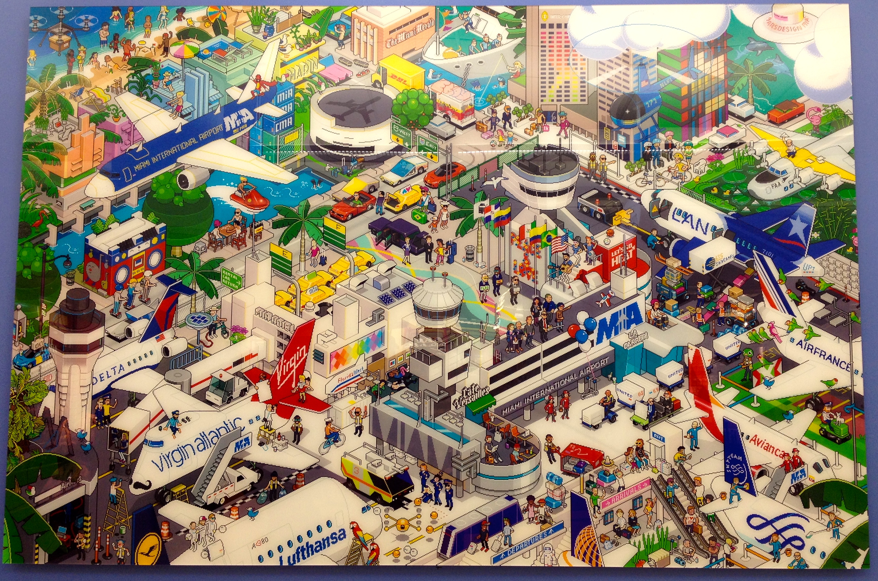
If you happen to be in Terminal J look out for a big bright and colorful piece of Pixel Art of MIA.

For those of you too far away to see it up close and personal, here’s a photo I’ve taken so you can see how fun it looks 🙂

Miami International Airport eBoy Miami by Mars Design Miami.
This is the artwork currently displayed at Miami International Airport. Oct 2015.

eBoy explain that a Pixorama is a mix between the words : Pixel & Panorama. It is a Digital Art Work that is created pixel by pixel on a computer. It is a new technique of Art creation and its it allows great creativity.

For the first time, Mars Design Miami and eBoy bring their talent to a very specific project by pixelising MIA as a “city” itself.

The eBoyMIA Pixorama landing took place at the Miami International Airport with a presentation of a big print of the Artwork on the walls of the MIA.

For more information about the above artwork please visit eBoy Miami

The Beach and surrounding areas pixel style. Click the photo for more info.
The Beach and surrounding areas pixel style. Click the photo for more info at eboymiami.com

They also depict areas of Miami and Miami Beach in another colorful pixel artwork.

It’s fun to pick out areas that you recognize.

Can you spot the funky Lifeguard Huts on the beach, The Living Room from the Design District, the art deco hotels?…take a look and see what you can find. There’s so much packed into the artwork it may take you a while.


If you liked this, you may also be interested in
Give Your Walls Some Love


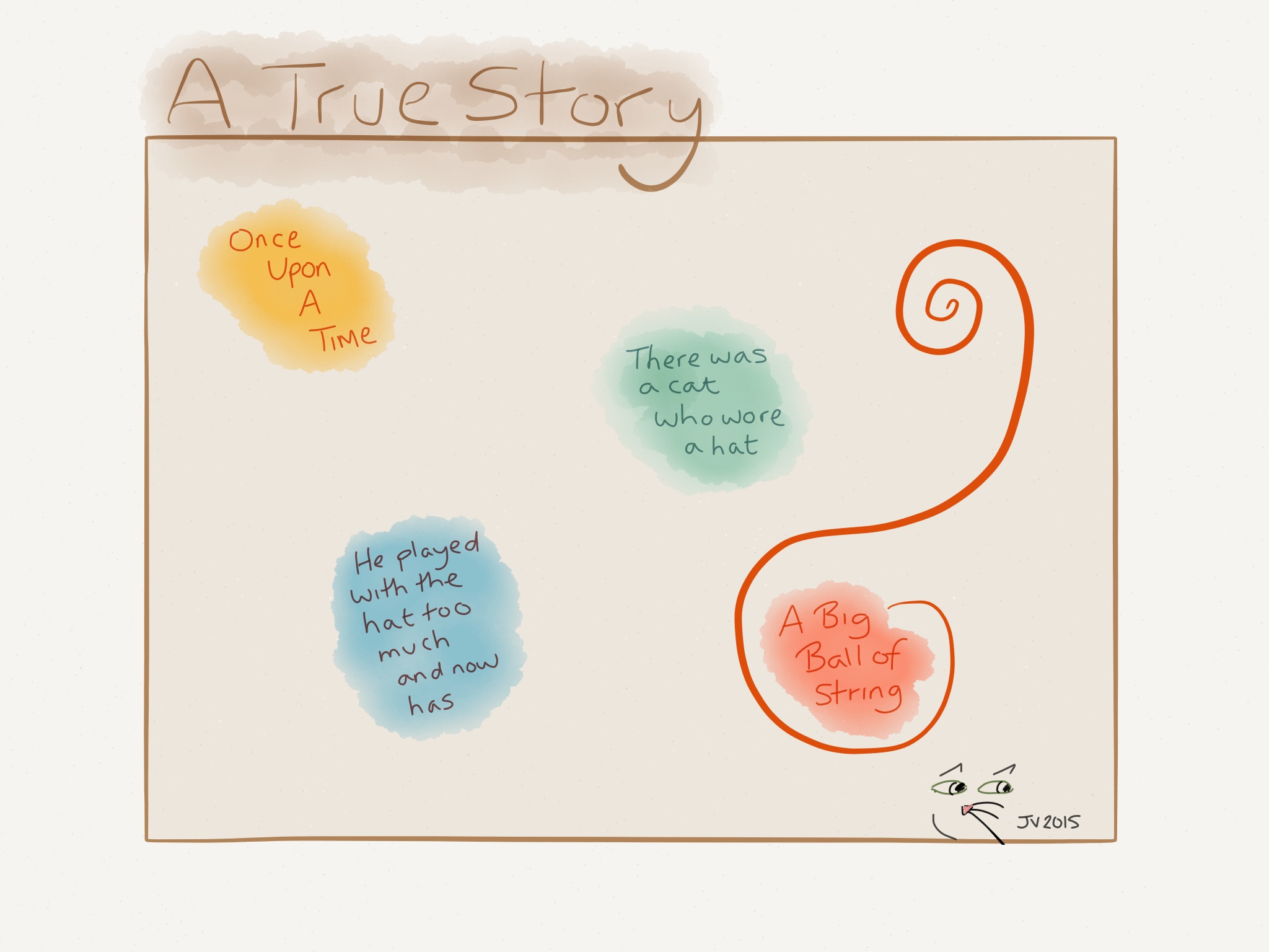
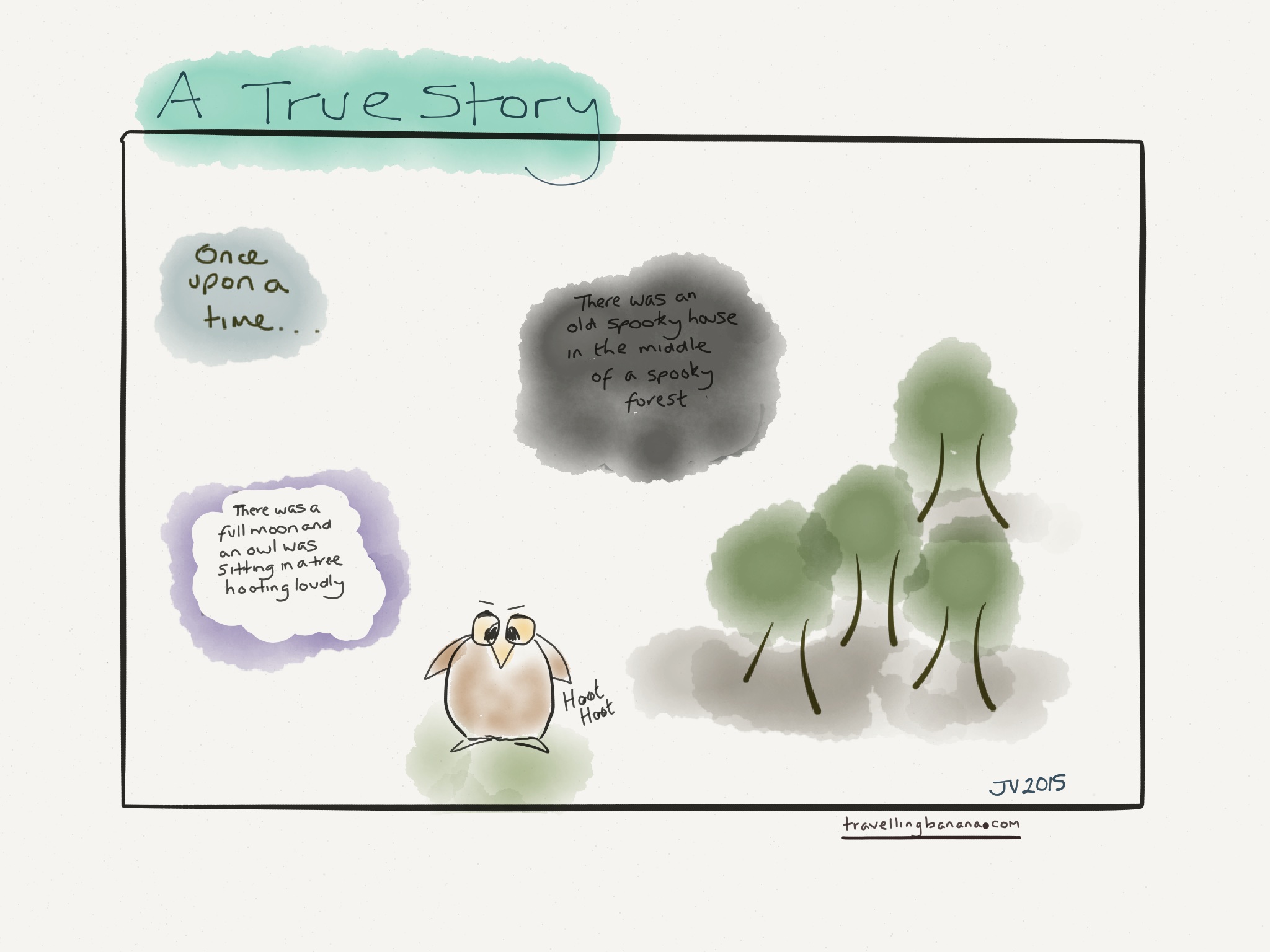
Sketch Sunday: A True Story

Today’s Sketch Sunday drawing – This may very well become a series – watch this space 🙂

Watch out in the forest...you could be being watched...spooky!
Watch out in the forest…you could be being watched…spooky! A True Story.

Drawn in 53 Paper with my JaJa stylus


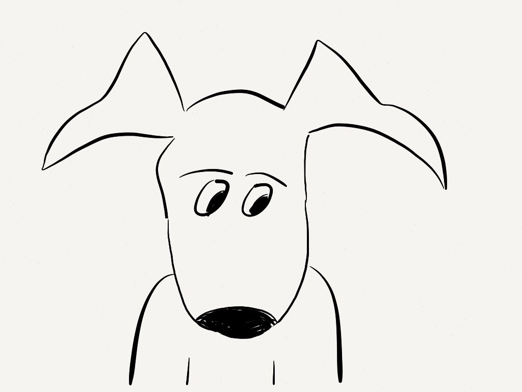
Have you missed one of my Sketch Sunday drawings why not check out Funny Frog, Caricature or Cartoon Dog


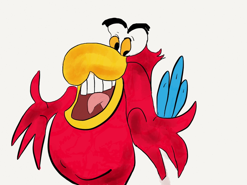
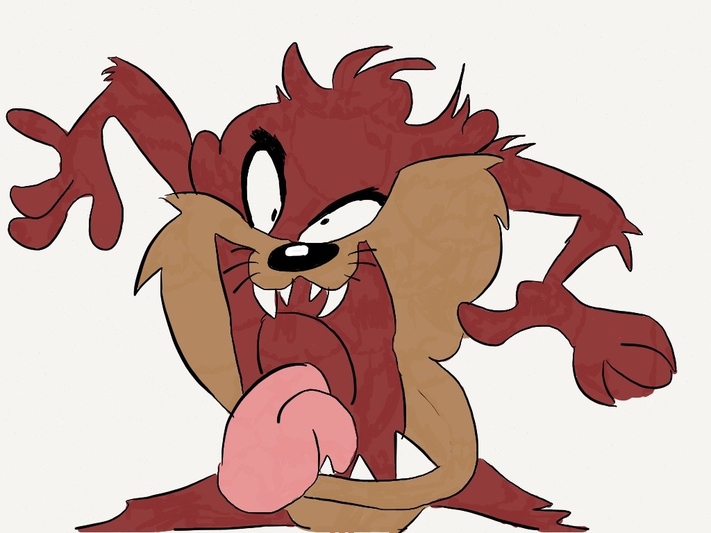
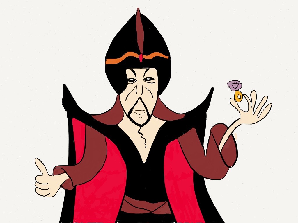
Grand Theft Auto V – Character Drawing

Here’s my interpretation of one of the characters from Grand Theft Auto V

One of the many colorful characters from Grand Theft Auto V

Drawn using 53 Paper and my JustMobile stylus


If you liked this, you may be interested in some of my other Drawings and which Stylus I use


A Wider View

Today’s Photo Challenge is capturing a wider view of a scene with the emphasis on looking at the basic elements in the scene – what will be in the foreground and in the background of the picture.

I think this photo taken at the Bass Museum of Art hits the spot.

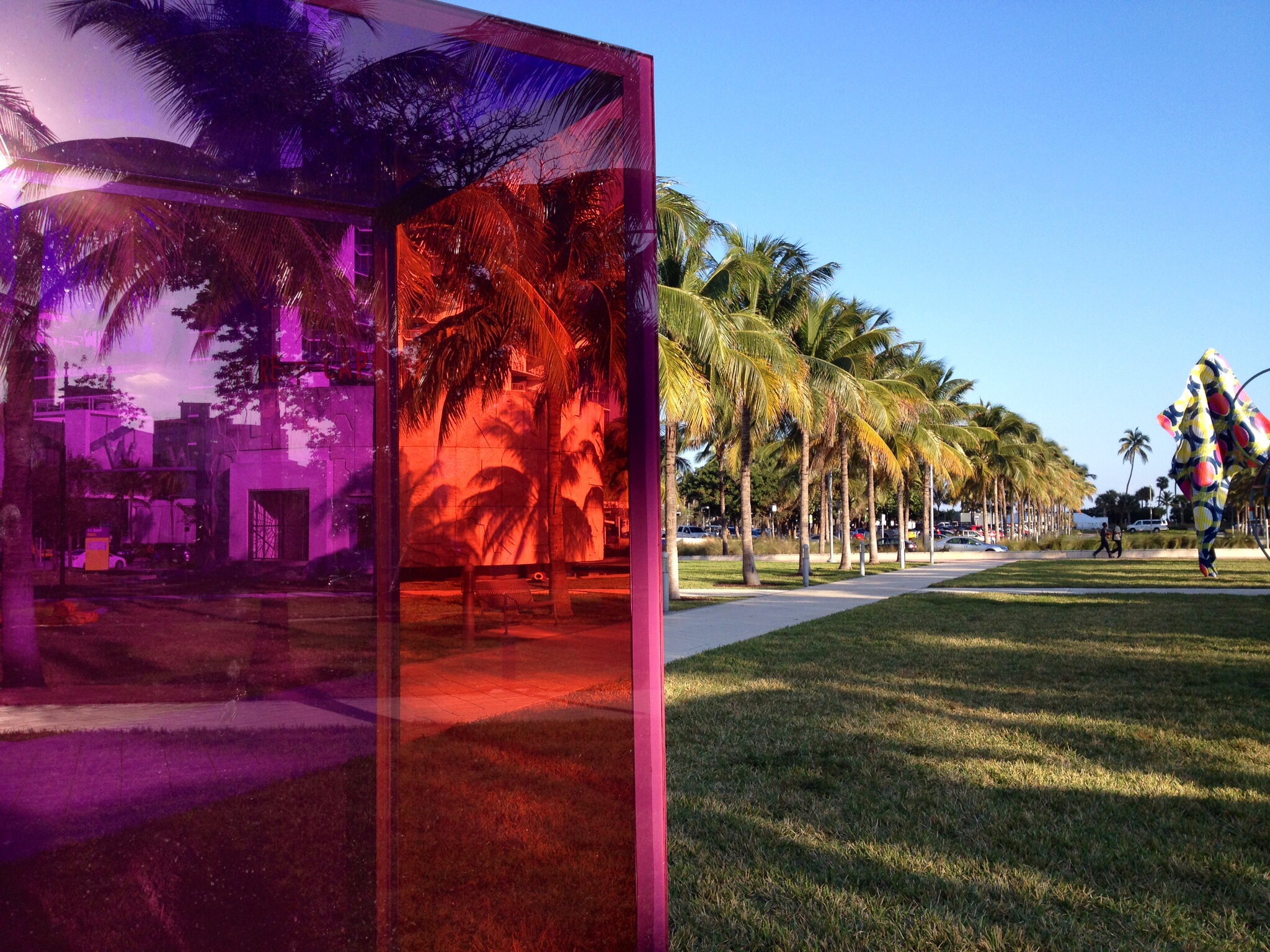
Some interesting artwork in the grounds of the Bass Museum of Art

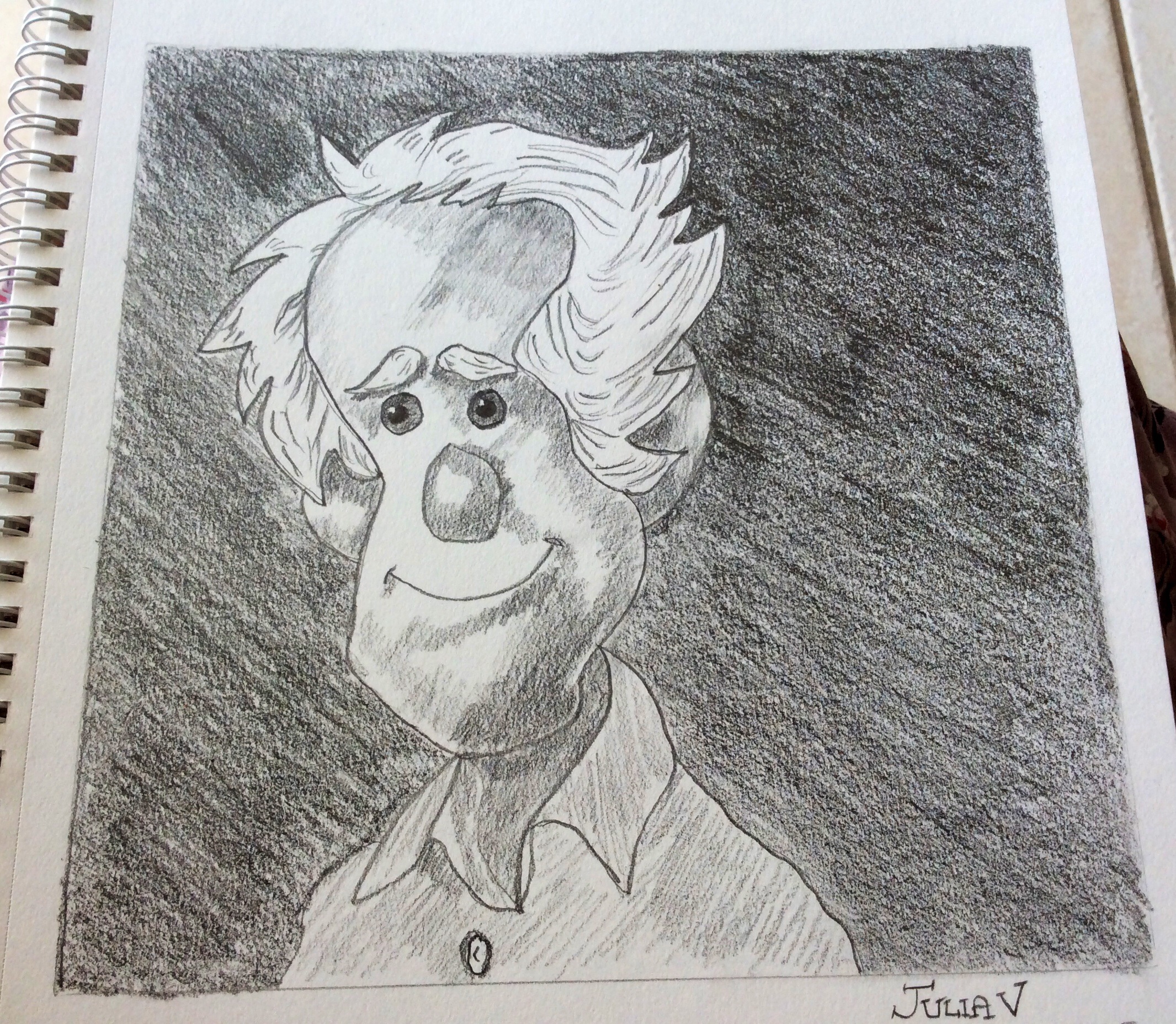
Sketch Sunday: Caricature

For this Sunday Sketch I drew a caricature style figure and again looked at various shading and hatching techniques.


For this sketch I used the following:-

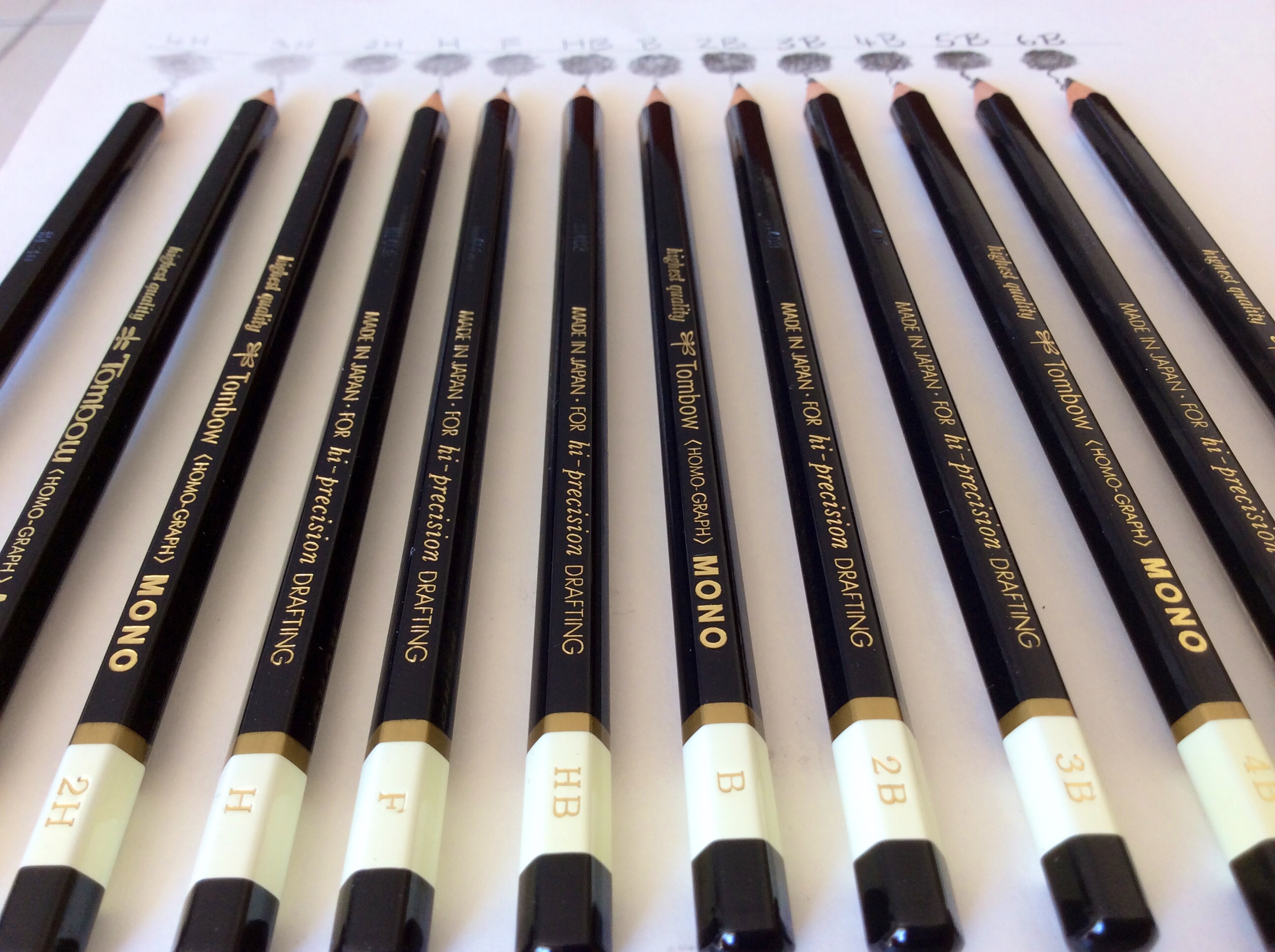
  • Different grades of graphite pencils: 2H, HB, 2B, 4B and 6B
  • Strathmore Windpower Drawing Sketchbook
  • a kneaded eraser
  • pencil sharpener

First of all draw a square on your sketchpad as a border. This will help contain the drawing area and make it easier to keep the proportions aligned well for your caricature to sit and to help you shade the background easier.

Next with an HB pencil lightly sketch the outline of the hair. Add outlines to show the position of the ears. At the midway point add eyebrows and eyes.

Lightly sketch in the nose and mouth.

Outline the neck, the collar of the shirt and the shirt.

Before continuing check that you are happy with the position of all elements and amend anything using the eraser.

Now it’s time to add the shading using various pencils, such as HB, 2B, and 4B. For example, an HB makes lighter lines than 2B or 4B.

Read more

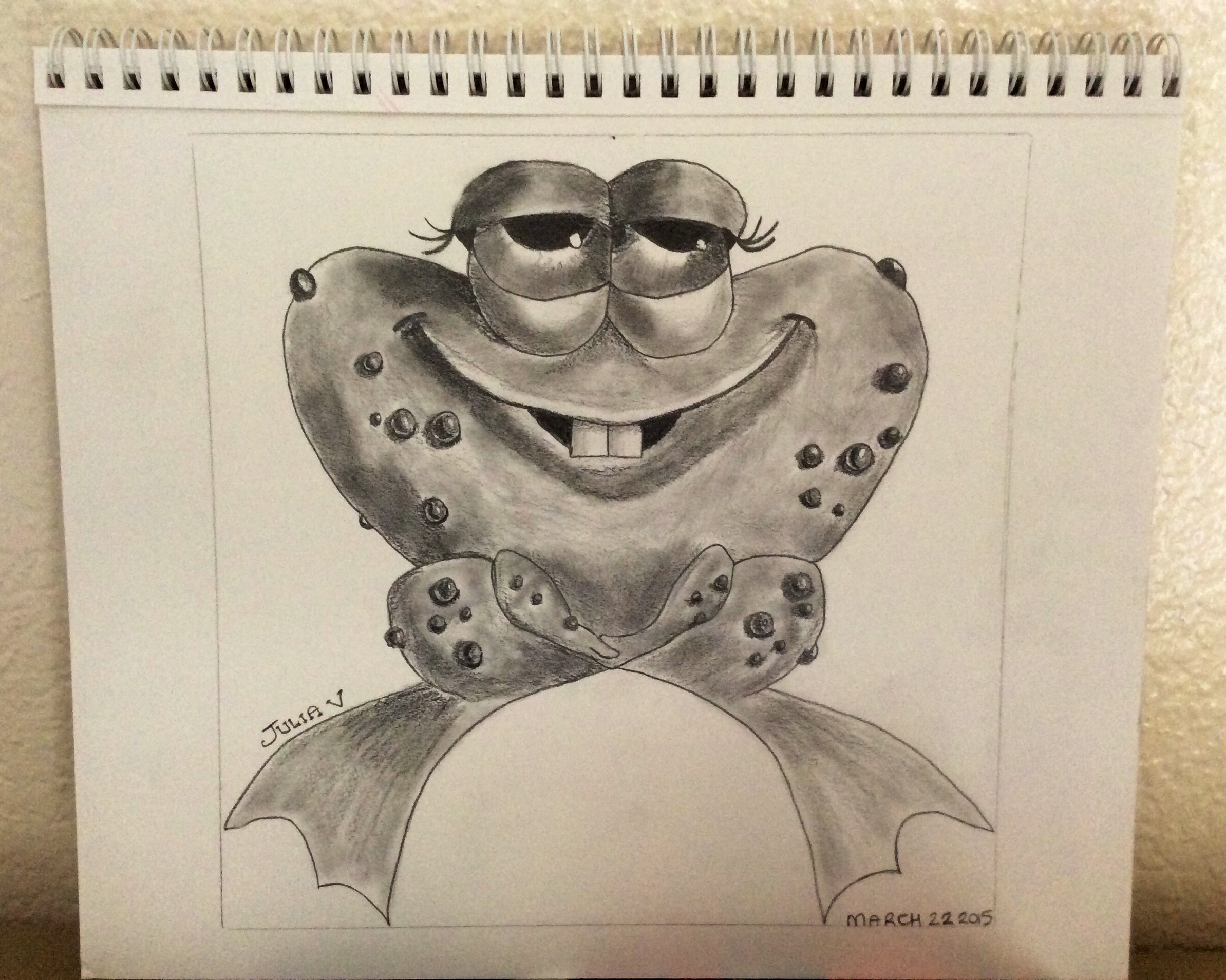
Sketch Sunday: Funny Frog

As part of my new feature series, Sketch Sunday, I will sketch a new drawing and explain how I made it. My first sketch is a comical looking frog.


For this sketch I used the following:-

  • Different grades of graphite pencils: 2H, HB, 2B, 4B and 6B
  • Strathmore Windpower Drawing Sketchbook
  • a kneaded eraser
  • pencil sharpener
  • Q-tip

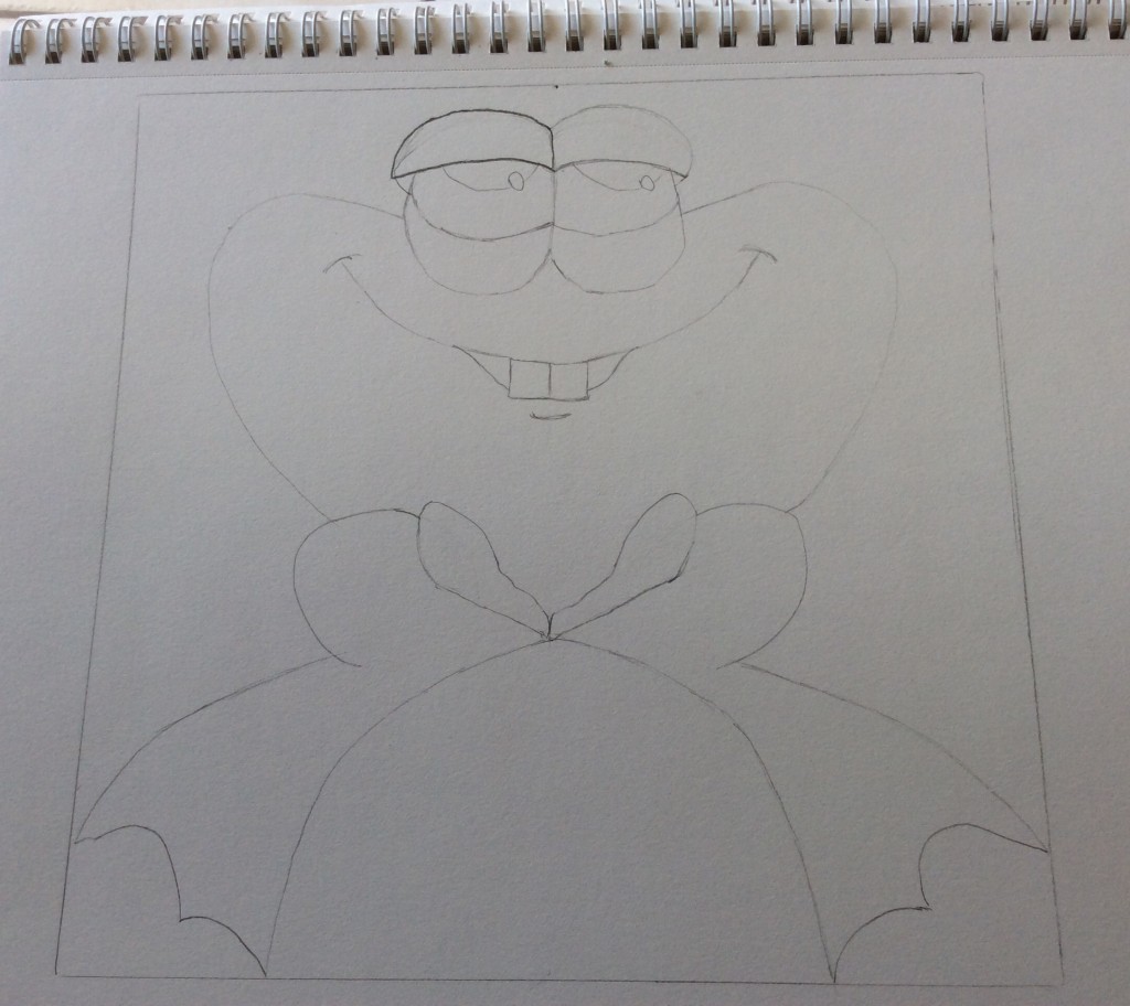
First I drew a square box on the paper to help contain the proportions of my sketch. I then drew a dividing line down the center as an aid to get the symmetry of the frog on either side.

I then drew the top half of his face and body and a couple of lines to mark where the legs and feet would go.

Roughly sketch the outline of the frog using a H pencil.

Two ovals become eyes. A slight curved line becomes a mouth with a couple of goofy teeth. I then erased all the guide lines and center marks so I was left with a plain frog sketch.

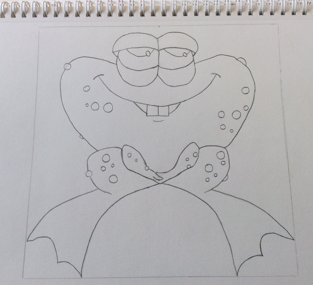
Next I used a 2B pencil to make some neat thin dark lines around the eyes, mouth and teeth. I then added some circles of different sizes that would become warts over his body. I finished off marking up the rest of the drawing with thin dark lines.

With a 2B pencil define the frog outline with a nice dark edge.
With a 2B pencil define the frog outline with a nice dark edge and add some different size circles to make warts on his upper body.

Next up is shading. First of all I used a HB pencil and added light shading to the frogs eyes, body, legs and feet. As I was shading I followed the contours of the lines, for example the curves in the eyelids. I continued in the same manner across the body and the legs with the darker shadows on the left and the lighter shadows on the right.

Read more