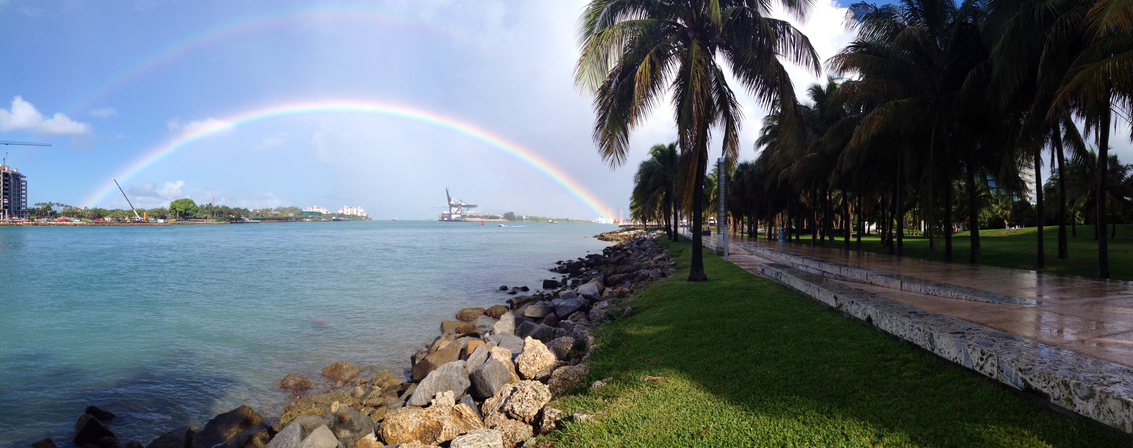
After breakfast we got caught in another rain downpour but we were rewarded with a wonderful rainbow.
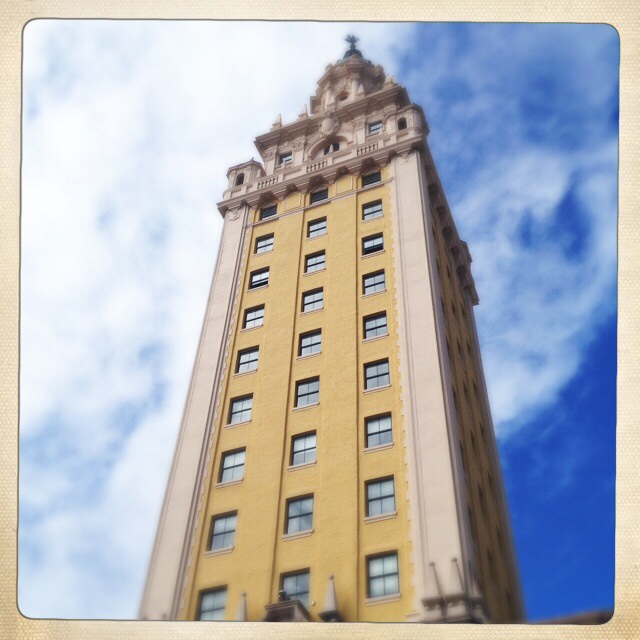
It looks like a gateway to Miami 😎
Creative Exploring

After breakfast we got caught in another rain downpour but we were rewarded with a wonderful rainbow.
It looks like a gateway to Miami 😎

From geometric patterns on skyscrapers to the ironwork on historical buildings, there are many opportunities to capture the beauty and complexity of architecture.
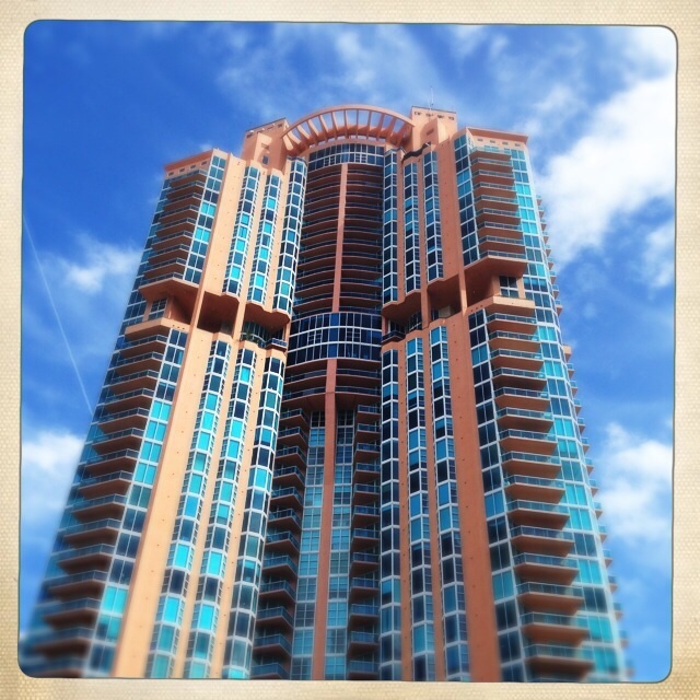
One of the tallest buildings in Miami Beach (and one of the most expensive places to live) is the Portofino. Even though it’s a tall skyscraper of a building, it still manages to look Art Deco in style. You can’t fail to miss the bright orange and blue building reaching into the sky.
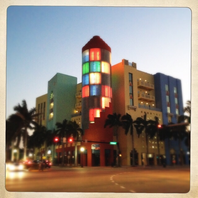
In the day the next building is nothing special but at night it comes alive with a spectacular light show. I think it really shows the architecture of the building better at night.
The next buildings are examples of some of the art deco hotels and buildings we have here in Miami Beach. The height restrictions are preserved in the art deco district so we’re lucky not to have high rise condos and hotels ruining the area.


Picture a dreamlike setting complete with exquisite, hand-painted frescos on barrel-vaulted ceilings, brilliant travertine floors, fine marble columns, intricate leaded glass fixtures, carved mahogany furnishings and lavish gardens. Then picture this all in the shadow of a spiraling Moorish Giralda tower. 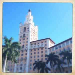
Is it a Spanish castle or a grand Venetian palazzo?
Although The Biltmore in Coral Gables, Fl does resemble the finest in classic Mediterranean architecture, it is neither an Italian palazzo nor Iberian castle. Instead it is the centerpiece of George Merrick’s vision of Coral Gables as an elegant, stately suburb, which he called “The City Beautiful.”
Combining his deep affection for lush South Florida landscape with a high regard for Italian, Moorish and Spanish architectural influences, Merrick realized his dream in the construction of his masterpiece.
You can find out more about the Biltmore Hotel here
Architecture and Monochrome
The above buildings work really well in color but what happens when you turn them black and white. Which do you prefer?

The colors in our photographs are evocative and rouse emotions within us. Color can elevate a mundane image into something intriguing and meaningful, and can tell a particular story within the frame.


The Best Stylus to buy has always been a tricky venture. Ever since iOS and Android devices have been designed with their finger friendly screens there’s always been a limitation when drawing or writing on occasions. It’s a bit of a minefield and as Apple seem to refuse to make a stylus for their own products it’s left to other manufacturers to come up with a solution.
Each one has their own special quirk and has often some alliance to one particular app, so unless you have the app the pen will work with to get the most out of the pressure sensitivity and other features you’re not going to be getting the full user experience even though you’ve paid full price!
I’ve used a number of styluses from the cheap $0.99 version that feels so thin and cheap in your hands and ends up having to be dragged forcibly across your screen to the polar opposite end of the fancier pressure sensitive pens that can set quite a dent in your pocket. Which all means trying to find THE pen is extremely difficult. I don’t want you to fall for the uber cheap version but I understand you may feel wary parting with large amounts of money. Luckily I have boldly ventured forth on your behalf and can at least share my experience so far.
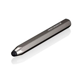
I’m using two different stylus or should that be styli. The main one I have been using is the JaJa Pressure Sensitive stylus from HEX3 but I’ve had some issues with connectivity and pressure sensitivity so I’m not going to recommend it here, even though I really do enjoy using it.
If I love it why am I not recommending it to you?
Well, I’m on my second pen. The first one failed to connect to the apps as promised and the button just did not work. Not to be deterred I got a replacement but this one also failed to work. The connection was better but the pressure sensitivity would not work because 90% of the time it would not come on and would make an awful electrical buzzing noise. I still have both but they are used purely as non working “insensitive” pens! Sorry HEX3 but that’s the bottom line. I really wanted to love this pen but you have ignored my emails to try and get the problem sorted but you’ve gone dark so I guess I’m on my own with broken styli!
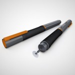
However, not holding a grudge I’ve kept an eye on their new developments and they appear to have been working hard on some new and hopefully better models which look interesting and work across multiple devices. Maybe they’ve just been too busy developing to answer any concerns from past customers. Anyway, the proof will be in the pudding and if I venture down this route I will report my findings. I’ve been extremely disappointed by this company so I’m not too confident ordering from them again but I will showcase their new range within this article so you can make your own decision.

I’d like to share a selection of my most recent doodles and drawings that can be found on my Tumblr account – The Picture Window. They are drawings plucked from my creative mind or inspired by surroundings or my interests.

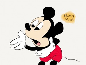
I had been drawing some well known cartoon characters for a while that were full of bold colors and larger than life features and I really enjoyed the challenge of trying to capture everyone’s favorite cartoon icons. It’s harder than you think!
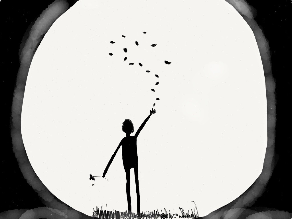
I then started to explore black and white doodling. One of my favorites is Moonlight. It’s very simple but sometimes the moon really is that big and makes you feel very small.
I made the drawing using the app Paper by 53. It really does make it easy to pick up your device and start drawing. Paper by 53 is just like using an old fashioned piece of paper. There are no fancy layers or hundreds of options to delete your work. You have a selection of pens and pencils of varying strengths and thicknesses, a palette of colors with a mixer option, a great zooming in feature for all the small detail and an eraser. With only these options available it really focuses the mind just like using the real thing.
[alpine-phototile-for-tumblr src=”user” uid=”juliav1.tumblr.com” imgl=”tumblr” style=”wall” row=”5″ size=”240″ num=”20″ shadow=”1″ border=”1″ highlight=”1″ curve=”1″ align=”center” max=”100″ nocredit=”1″]
The drawing of the cat on the lined paper is not my drawing but one I found amongst the many talented artists who post their work on Tumblr.
The featured image of the sneakers I’ve used to illustrate this post was quick and easy to do. I was really pleased with the results and I hope it conveys a sense of relaxation when you look at it. Even though I didn’t define any legs I think it gives the illusion that there are actually some there. My mind seems to fill in the blanks. I’m also hoping that the actual shoe looks like it is filled with a foot so I tried not to make it look flat and lifeless. Did it trick your mind too?
