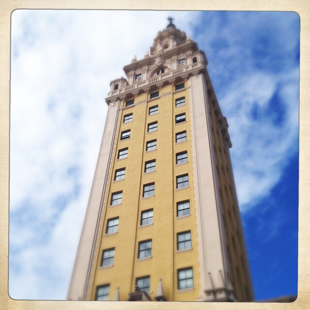
From geometric patterns on skyscrapers to the ironwork on historical buildings, there are many opportunities to capture the beauty and complexity of architecture.
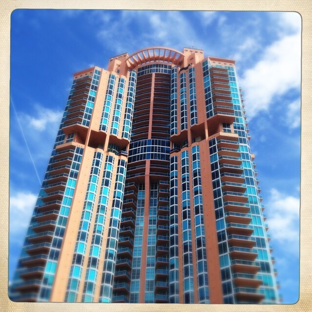
One of the tallest buildings in Miami Beach (and one of the most expensive places to live) is the Portofino. Even though it’s a tall skyscraper of a building, it still manages to look Art Deco in style. You can’t fail to miss the bright orange and blue building reaching into the sky.
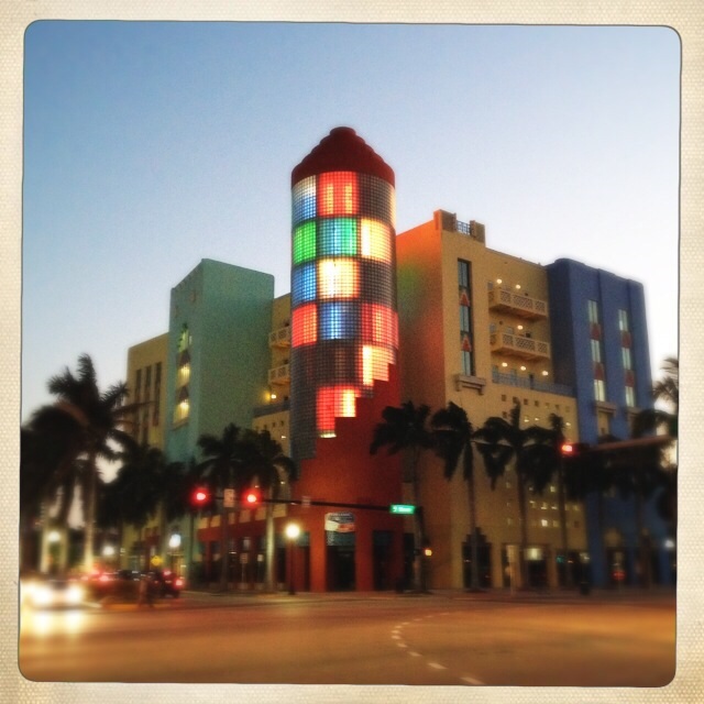
In the day the next building is nothing special but at night it comes alive with a spectacular light show. I think it really shows the architecture of the building better at night.
The next buildings are examples of some of the art deco hotels and buildings we have here in Miami Beach. The height restrictions are preserved in the art deco district so we’re lucky not to have high rise condos and hotels ruining the area.


Picture a dreamlike setting complete with exquisite, hand-painted frescos on barrel-vaulted ceilings, brilliant travertine floors, fine marble columns, intricate leaded glass fixtures, carved mahogany furnishings and lavish gardens. Then picture this all in the shadow of a spiraling Moorish Giralda tower. 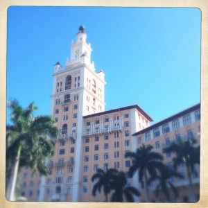
Is it a Spanish castle or a grand Venetian palazzo?
Although The Biltmore in Coral Gables, Fl does resemble the finest in classic Mediterranean architecture, it is neither an Italian palazzo nor Iberian castle. Instead it is the centerpiece of George Merrick’s vision of Coral Gables as an elegant, stately suburb, which he called “The City Beautiful.”
Combining his deep affection for lush South Florida landscape with a high regard for Italian, Moorish and Spanish architectural influences, Merrick realized his dream in the construction of his masterpiece.
You can find out more about the Biltmore Hotel here
Architecture and Monochrome
The above buildings work really well in color but what happens when you turn them black and white. Which do you prefer?


Let me know which style you think works better?

great job i like your photos
I really enjoyed the photos of the buildings! Personally I like my photos in colour so I have yet to get Monochrome. Don’t worry it will come to me . . . eventually 🙂
Me too, they really suit the style of these buildings but it’s interesting to see the effect. Thank you
I really like the black and white. The buildings feel vintage to me – but then I’m also a sucker for B/W! 🙂
Thanks – yes good point. I do like the fact that B&W has a timeless quality to it.
I prefer the colour images on the as they highlight the architects desire to be different, not only in design of the buildings shape but also in presentation. However, the buildings in the art deco zone look more interesting to me in monochrome.
Just for interests sake, what is your preferred focal length when making architectural images?
Thank you for taking the time to comment – yes color vs black and white photos are so different and it’s good to try both on a subject.
Hmm, focal length is a tricky one as it all depends on the situation. I don’t have a preferred focal length but I will look at the exif data and see what I’ve used.