How to make realistic rivets in Photoshop

I decided to try my hand at making some realistic looking rivets in Photoshop and share the steps here so you can go ahead and make some too.

I’m using Adobe Photoshop CS5. So if you’re ready, open up Photoshop and get ready to learn how to make realistic rivets that can be used on many things.


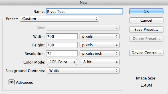
Start by opening up a new file.

File → New. As this is a test document set the size to the following dimensions:-

Set up your file using these dimensions

Double click the background layer to unlock it.

Fill the space with either a pattern or a style of your choosing.

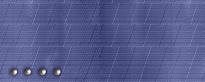
Add a new layer. Check the color you have set as the foreground and change it to a grey color. I used #a3a0a8.

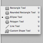
With the new layer active, select the Ellipse Tool and drag the mouse to make four circles near the edge of your pattern. They will autofill with your selected foreground color. You may want to make a new layer per circle so that you can move them about in your scene, especially if you want to line them up one under each other. To make a perfect circle don’t forget to hold down the shift key as you drag the mouse.

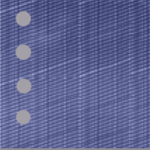
They don’t look much like rivets just yet so we’re going to add some effects to these flat looking circles to make them stand out and add some shine.

Read more

The Drawing Pencil Guide

I’ve recently bought some Tombow Mono Pencils. They range from 4H to 6B but what do those numbers and letters mean?

Tombow Professional Drawing Pencils

Let’s find out in this quick Drawing Pencil Guide:-

The grading scale number first gives a clue of how hard the graphite in the pencil will be. The higher the number, the harder the graphite, and the lighter the mark will be on the paper. The higher the number, the darker the mark will be on the paper and the graphite in the pencil will be softer.

The second grading scale on the pencil is the letter. The letter H indicates a hard pencil whilst the letter B indicates the blackness of the pencil and a softer graphite pencil.

The letter F is the middle point pencil sitting between HB and H and has a very fine point. This pencil has a limited amount of graphite and more clay in the mixture.

A 4B pencil would be softer than a 2B and a 3H harder than an H.

Drawing Pencil Grades

Hard4H to 3H

Medium Hard2H to H – This pencil makes light marks. It is good for drawing details and preliminary drawings that are not permanent
MediumF to HB
Medium SoftB to 2B  – good for outlines

Very Soft5B to 6B – these pencils make dark softer marks.
Soft3B to 4B


The B pencil is good for medium to light shading and the 2B for medium to dark shading. You can get more variety of shading from using the B pencils depending on the pressure used.

The H pencil is the harder grade and is good for fine, light and some shading.

I’m looking forward to testing them out.


I hope you found this drawing pencil guide useful. Other art related articles you may be interested in:-
Sketching in the Wolfsonian
The Best Stylus
Drawings and Doodles on Tumblr